Measuring the Added Information Utility of Visual Media for Summarizing Crises
By ignoring images and videos, a large amount of crisis-related information could go unnoticed.
- Cody Buntain, University of Maryland
- Tasmeer Alam, University of Maryland
- Mohammed Ansari, University of Maryland
Synthesizing informative summaries from noisy, diverse, and multimodal streams of documents is a long-standing problem across research domains (e.g., information retrieval, natural language processing, etc.). In this project, we extend prior work on the CrisisFACTS community data challenge from NIST’s 2022 and 2023 Text Retrieval Conference (TREC) to build an evaluation framework and summarization pipeline that integrates both textual content and visual media to create daily summaries of important crisis-related information. Core questions in this project examine whether the inclusion of visual media enhances our traditional text-based summaries, which vision-language models (VLMs) perform best in extracting facts from images, and whether large language models (LLMs) can adequately stand in for human assessors when evaluating such crisis summaries. Across 18 crisis events, approximately 15 thousand images, and 1.5 million pieces of text content, results demonstrate that images add a non-trivial set of unique information; approximately 51% of facts extracted from images have no matching text-based fact. That said, image-based facts appear, on average, to be less important to the crisis summary than text-based facts. In assessing these crisis-summarization systems, we also show that LLMs perform nearly as well in fact assessment as trained human assessors for the task of identifying useful and non-redundant crisis information. Taken together, our findings show that ignoring visual media excludes a substantial amount of unique crisis-related information, and one can reasonably deploy automated evaluation frameworks in assessing the output of these crisis summarization pipelines. This latter finding is particularly important for extending test collections like CrisisFACTS when adding new data and new modalities.
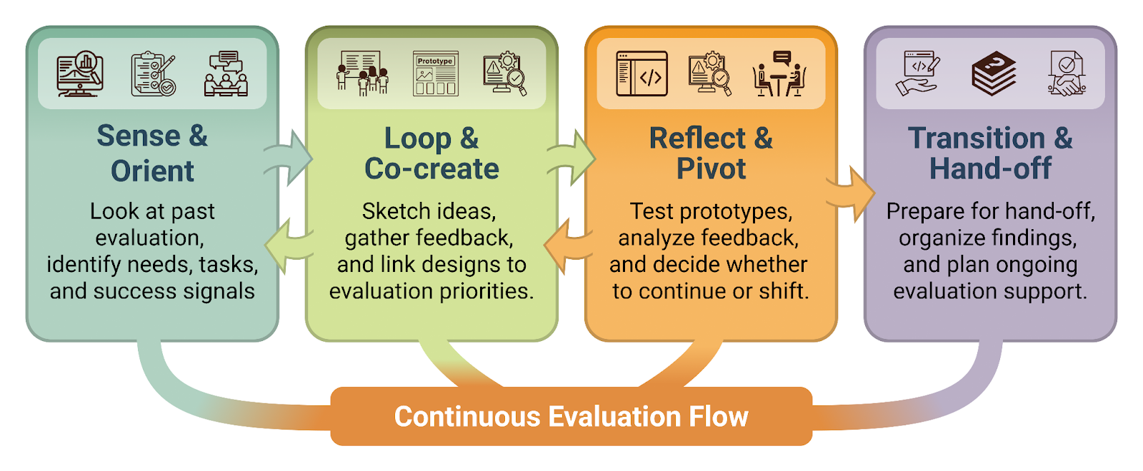
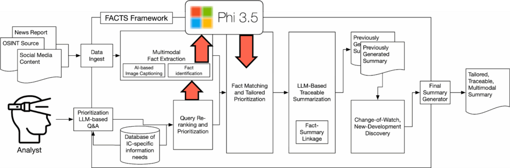
Our foundation for this work is the FACT Framework, as outlined in Figure 1. This framework consumes data from multiple online information sources and modalities–images and text pulled from social media and news–along with a preset collection of task-specific queries to produce tailored, traceable, multimodal daily summaries. FACTS maintains separate pipelines for text and image data, allowing for us to, in parallel, extract relevant facts from images via a VLM and use standard text-retrieval algorithms to identify relevant textual content. This process produces a uniform collection of textual facts along with a link to the original text/image-based message from which that fact was extracted. We then merge the resulting fact set to aggregate similar facts into a smaller collection of “meta” facts, where each meta-fact can be traced back to one or more pieces of original content. For each of these facts, the framework leverages several thousand pieces of labeled content from prior crisis-informatics work to infer its importance for a crisis-response stakeholder. The FACTS framework then re-orders these meta-facts based on this priority and relevance to the set of user-provided queries to produce its output summary for a given day. In future iterations, we will compare these daily summaries to identify which facts are new developments in the event and should therefore be surfaced first.
Based on this framework, we can examine the following main research questions:
- RQ1. For automatic assessment of new crisis summaries, how consistent are LLMs in their annotations compared to trained human assessors?
- RQ2. Across multiple VLMs, which model produces information that best aligns with the text-based facts already extracted?
- RQ3. What is the relative importance of facts produced from images compared to those produced from text-based messages?
- RQ4. What is the quantity of new, useful information produced in the summary that is exclusively supported by images?
Leveraging LLMs for Annotation Fact Utility
While human assessors are ideal for annotating whether facts are useful for a summary, such assessment is costly. Some form of annotation is critical for this study, however, as a core question we have is the degree to which images introduce new useful information. Consequently, we cannot rely solely on prior results from the CrisisFACTS data challenge, as participants in that challenge used only textual content to create summaries. As such, we first answer RQ1 with experiments into replacing these human assessors with LLMs. To this end, for each day in the CrisisFACTS 2023 dataset, we use a collection of LLMs to assess whether each fact in that day is useful, redundant, poor, or irrelevant. We then map these class labels to the same space as the CrisisFACTS assessments and compare via standard correlation metrics. For comparing these LLM assessments to trained NIST-provided assessors, we evaluate the correlation between LLM- and NIST-assessor scores for each day and then aggregate up to the event level. This experimental framework lets us compare multiple LLMs to NIST-assessor baselines and evaluate which LLM best correlates with manual annotation. Table 1 shows these average correlations between NIST assessor scores and LLM-based annotation. While OpenAI’s GPT offerings (GPT4o-mini and GPT5) perform highly, local models–namely Ministral 8B and Qwen 3–are at least as competitive as the GPT models. Ministerial 8B is of particular note as its wall-clock runtime is much faster than Qwen 3 and Llama 3.1.
| Mistral 7B | Llama 3 7B | Llama 3.1 80b Quant | Ministral 8B | Mistral 7b v0.3 | Qwen 3 | GPT4o- mini | GPT5 | |
| Average Correlation | 0.2248 | 0.2171 | 0.3464 | 0.3460 | 0.2742 | 0.3905 | 0.3641 | 0.3860 |
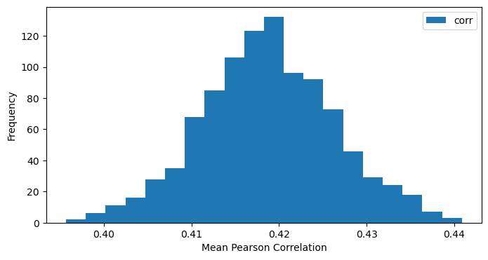
The relatively small gap in performance between what should be the most performant GPT models and the local open-source models suggests that performance in this fact-annotation task has hit a ceiling. We therefore compare these correlations to a similar form of inter-annotator agreement among the NIST assessors. Using a form of cross validation, where we hold out one of the original six NIST assessors, we can measure the correlation among human assessments. Figure 2 shows the bootstrapped distribution of this correlation across 1000 replicates, with a mean correlation of 0.4187 and a 95% confidence interval from the empirical distribution between 0.4029 and 0.4345. This distribution provides an answer to RQ1, as Qwen 3 and GPT5 are both very close to aligning with manual annotation. For the remainder of this article, we use Ministral 8B for LLM assessment as it is much faster compared to other models.
Importance of Image-Centric Fact Extraction
In the following analysis, we focus on a collection of several hundred images we have identified as being highly relevant crisis-related images from the CrisisFACTS 2023 challenge. This focus allows us to exercise these computationally intensive models quickly before running on the much larger set of 15 thousand images available. In assessing the unique facts produced from these highly relevant images across the various VLM models, we first count the number of facts each underlying model generates. We measure this number across nine models and a variety of parameter sizes, from 4.2B (Phi 3.5) to 27B (Gemma 3). Then, using the importance classifier described above, we measure the proportion of facts produced that are of high importance. Table 2 shows results of facts extracted and their importance, with models ranked by proportion of important information. InternVL generates the highest proportion of important content (nearly 50% of facts are tagged as important), whereas both InternVL and Gemma 3 produce the largest volume (n=206 and n=215 respectively). Interestingly, the Llama 3.2 model produces the highest volume of facts in total, but the majority of them get tagged as low-priority.
| Model | Parameters | All Facts | Important Facts | Proportion | Run Time |
| InternVL 2.5 MPO | 8B | 417 | 206 | 49.4 | 28 |
| Google Gemma 3 | 27B | 507 | 215 | 42.41 | 294.98 |
| DeepSeek Janus Pro | 7B | 367 | 143 | 38.96 | 50.13 |
| Phi 3.5 Vision-Instruct | 4.2B | 379 | 140 | 36.94 | 36.32 |
| Llava 1.6 Mistral | 7B | 245 | 79 | 32.24 | 14.12 |
| Llama 3.2 Vision-Instruct | 11B | 581 | 173 | 29.78 | 93.99 |
| Llava 1.6 Vicuna | 13B | 383 | 105 | 27.42 | 20.08 |
| Llava 1.5 | 7B | 368 | 99 | 26.9 | 14.08 |
| Mistral Pixtral | 12B | 419 | 98 | 23.39 | 62.46 |
Table 2 also shows the average wallclock runtime, in seconds, needed to process an image for each model. All models are run on an RTXA6000 GPU in a high-performance compute cluster. Viewed through this metric, Google’s Gemma 3 is extremely slow in comparison to the other models, taking over three times longer than the next slowest model. Interestingly, the InternVL model produces both the highest volume of high-importance information and is one of the faster models, with only three models taking fewer seconds to run.
When we align these image-based facts to USEFUL and REDUNDANT collapsed facts from CrisisFACTS 2023, we measure the percentage of facts aligned to the text-based facts by each VLM model (Table 3). These results demonstrate that, for RQ2, InternVL is generally producing the best alignment with extant information from prior text-only models.
| Model | Total Facts | USEFUL | USEFUL % | REDUNDANT | REDUNDANT % | POOR | POOR % |
| InternVL 2.5 MPO | 185 | 44 | 23.78% | 120 | 64.86% | 7 | 3.78% |
| Google Gemma 3 | 189 | 43 | 22.75% | 116 | 61.38% | 8 | 4.23% |
| DeepSeek Janus Pro | 163 | 36 | 22.09% | 98 | 60.12% | 18 | 11.04% |
| Mistral Pixtral | 171 | 34 | 19.88% | 55 | 32.16% | 38 | 22.22% |
| Phi 3.5 Vision-Instruct | 178 | 32 | 17.98% | 110 | 61.80% | 16 | 8.99% |
| Llava 1.6 Vicuna | 169 | 22 | 13.02% | 76 | 44.97% | 36 | 21.30% |
| Llava 1.6 Mistral | 129 | 14 | 10.85% | 77 | 59.69% | 18 | 13.95% |
| Llama 3.2 Vision-Instruct | 191 | 19 | 9.95% | 124 | 64.92% | 22 | 11.52% |
| Llava 1.5 | 152 | 14 | 9.21% | 80 | 52.63% | 20 | 13.16% |
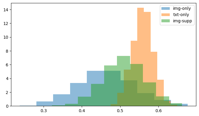
Selecting InternVL as our main VLM, we compare facts supported by images to facts supported by text using a larger set of images and facts as input. Figure 3, below, shows that, for 328 facts extracted from CrisisFACTS-001-r2, the average imputed priority score for facts that are supported only by images is significantly lower than facts supported by either text alone or a combination of text and images. More specifically, Figure 3 shows bootstrapped mean importance scores for 36 facts supported only by images, 292 facts supported only by text, and 71 facts supported by both modalities. Extending this analysis to 8,455 images and 912,960 text-based messages across all 18 CrisisFACTS events, however, we see a different result in that, on average, images have a higher per-event-day importance (0.4745) versus text (0.1398). These measures are before summarization though, as we are still working to run the full pipeline across all events and resolve facts across modalities.
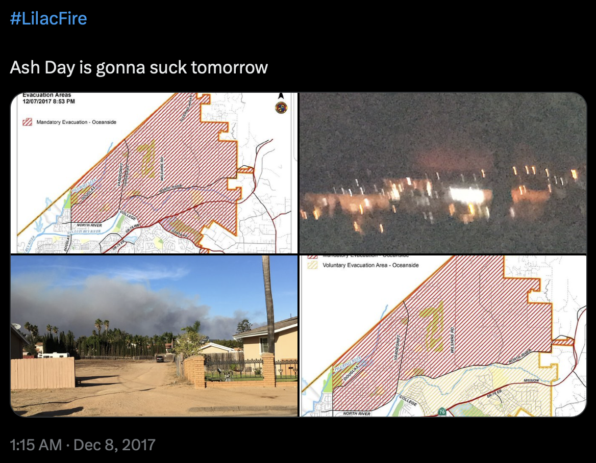
In the sample from the Lilac Wildfire (CrisisFACTS-001), we find high-importance information shared via images even when the underlying textual content is uninformative. For example, Figure 4 below shows images of impacted areas and evacuation routes even though the text, “Ash Day is gonna suck tomorrow”, yields little useful information about the event. In total, when inspecting the CrisisFACTS-001-r2 event-day pair, the answer to RQ4 appears to be that text-based facts are much more prevalent (n=292), but of the 71 facts supported by images and text, 36 (>50%) are supported by images alone, even if these image-based facts are, on average, less important than their text-based counterparts.

- Categories: