Communicating Intel to Decision-Makers: Toward the Integration of Graphs in Reports
Melanie Bancilhon, R. Jordan Crouser, Alvitta Ottley
Intelligence analysts’ roles include analyzing reports, identifying important information relevant to the current state of affairs, and communicating their takeaways. These reports are then analyzed and reported to decision-makers or translated into a presidential brief. While these tasks seem consistent across analysts, each step differs in its content, level of detail, and format. The purpose of this research is to gain an understanding of how consumers of analytic products receive and interact with reports. This was accomplished via a series of online questions to 22 experts recruited to provide input. Our analysis provides insight into what makes analytic products effective for decision-makers, which could improve the quality of reports produced and alleviate common customer pain points, should recommendations be appropriately incorporated.
Introduction
The primary objective of intelligence analysis is to deliver “the right information, to the right person, at the right time, communicated in the right way.” The outputs of such analysis, or analytic products, may take the form of intermediary data (e.g. a curated or enriched dataset) intended to be used as input for subsequent analysis or end-products (e.g. written reports, interactive dashboards, daily briefings, and placemats). These aim to provide decision-makers with a concise, well-supported discussion of the findings and any associated recommendations.
Digital intelligence reports allow for a variety of formatting options and can include images and links (e.g. to other reports, web pages or audio and video files). These reports also allow for user interactions such as highlighting and note-taking. Little is known about how report formats vary across tasks and analytical workflows, and how analysts interact with different report formats. By gaining insight into analytic reports formats and user interactions, we can develop better tools that are tailored to different analytical workflows and tasks.
At present, the personal tailoring of analytic end-products is a painstakingly-manual process. Because of its labor-intensive nature, it is often only those individuals in positions of substantial power who are able to reap the benefits of bespoke analytic products. However, the quality of decisions made “at the top” are fundamentally bounded by the quality of decisions made at all preceding levels. Moreover, prior studies suggest that even when presented with all of the relevant information, decision quality suffers when that information is presented in a format that is poorly suited to the individual decision-maker. We share the results of 22 interviews with decisions makers in the intelligence community to understand the existing practices for information dissemination and how decision-makers ingest analytic end-products. Using this information, we propose design guidelines for developing reporting tools that can readily adapt to the needs of individual decision-makers.
Background
The effect of adding images to text has been studied for many decades in the Psychology literature [Levie and Lentz(1982)]. Researchers argue that illustrations contextualize information contained in the text and helps the viewer to organize and interpret it [Bransford and Johnson (1972)]. For example, studies suggest that adding relevant images to text improves comprehension and retention [?]. One study has shown that the textual component can actually be the most memorable part of a visualization in a memory task [Borkin et al. (2015)]. Brunyé et al. demonstrated the value of multimedia formats for improving performance: participants who relied on instructions combining text and diagrams assembled a toy significantly faster and more accurately than those who were given text-only or illustration-only instructions [Brunyé et al. (2006)].
Although the exact cognitive process underlying such betterment remains debated [Levie and Lentz(1982)], the benefits resulting from pairing text with relevant graphics are of particular interest to the Visualization community. In 2013, Kosara et al. [Kosara and Mackinlay (2013)] proclaimed Narrative/ Storytelling Visualizations (combing text and visualization) to be “the next step for visualization”, and researchers have explored different storytelling techniques [Hullman and Diakopoulos (2011), Hullman et al. (2013), Segel and Heer (2010)].
There has been extensive research in the fields of multimedia and data visualization that shows that data format can impact perception, reasoning as well as decision-making. Zhi et al. has examined how different ways of integrating text and visualization impact comprehension and engagement in a storytelling scenario. They found that amongst all formats, comprehension scores were higher with slideshow layouts, where each frame contains the text and corresponding visualization displayed side by side and represents an event in the story [Zhi et al. (2019)]. Stokes et al. found that users prefer charts with the largest number of textual annotations compared to charts with fewer annotations. They also found that more takeaways and relationships are drawn when the text describes statistical or relational components of a chart [Stokes et al.(2022)]. Many other researchers have studied variation in personal preferences for charts versus textual representations.
Interviews with Analysts
We interviewed 22 professionals working in the intelligence space to gain insights about the way they interact with intelligence reports, their most used and preferred report formats and the types of decisions they make using the information from these reports. The interview contained a series of 18 questions (see supplementary material for questions).
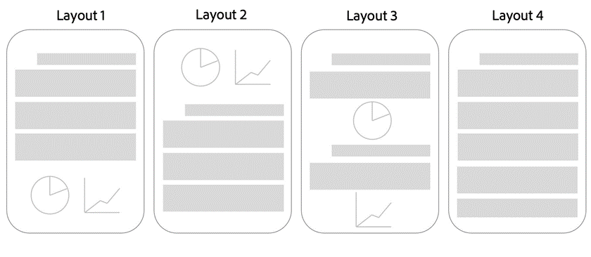
We presented analysts with four different potential report layouts. In layout 1, the graphs are presented at the end of the documents. In layout 2, the charts are presented first, followed by text. In layout 3, the charts are presented throughout the report next to the relevant text. Layout 4 is a report format without any charts (see figure 1).
What Makes a Report Useful?
The most common responses for what makes a report useful were Clear and Accurate (n=7), Concise(n=8) and Relevant (n=5). For example, one analyst said:
“Report is useful when it clearly identifies and defines concepts and provides understanding into the locations, importance of the group/person/asset, insight into the need/value of the collection and has relevant accompanying graphics to amplify data.“
Analysts reported the following useful features: tearline, charts and graphics, well sourced end-notes, easy to transfer and download, summary section, takeaway section.
Analysts Reading Patterns
In order to better understand layout and report format preferences, we examined analysts reading patterns. 7 participants stated that they “Quickly scan and jump to the most important content”, 5 stated that they “Read the entire report from start to finish” and the rest reported to use a combination of techniques, sometimes including both of these extremes. Among the 9 participants that used several techniques, 6 reported that they read all titles and headers first and two reported that they read the summary first.
The Prevalence of Charts in Intelligence Reports
We were interested in how often intelligence reports contain charts and graphics. Only one analyst reported that their reports never contain graphics. 8 participants reported that their reports sometimes contain graphics, 6 said that they contain graphics about half of the time, 6 said that they contain reports most of the time and 1 said that they always contain graphics.
Prevalence of Different Layouts in Reports
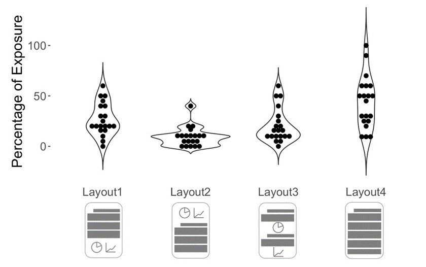
We asked analysts to report the percentage of reports that they receive that are presented in similar formats to Layouts 1-4 (e.g. Layout 1 = 70%, Layout 2 = 30%). One participant’s data was missing so we analyzed the responses of 20 analysts.
Figure 2 shows the prevalence of each layout across all 20 analysts, where each dot represent one participant’s response. We can see that roughly half of the participants receive Layout 4 at least 50% of the time and all of them receive Layout 2 at most 50% of the time. We computed the average of the reported percentages across each layout and found that overall, there is a 4.5% chance that a random analyst receives Layout 1, 0.5% that they receive Layout 2, 6% chance that they receive Layout 3 and 15.25% chance that they receive Layout 4. To understand the use of different report formats with more granularity, we compared exposure to type of decisions to uncover any patterns in the next section.
Do Analysts Receive Reports in Their Preferred Layouts?
We asked analysts to rank their preferred layouts and to justify their rankings. We found that out of the responses from 19 analysts, Layout 3 was ranked first the most (n=8) and Layout 4 was ranked last the most (n=14). We examined the rationale for these rankings and found that the analysts who ranked Layout 3 as most preferred like to see charts inserted next to their corresponding text to improve flow and comprehension.
“I prefer the graphics to be spread out throughout the text, like in Layout 3, and that they relate to the information within the paragraphs around the graphic.”
Analysts who ranked Layout 4 as their least preferred layout believe that reports with charts are faster to read, improve information retention, comprehension and consolidates information in the text. It is important to note that all three analysts who ranked Layout 4 as most preferred layout deem charts to be not necessary for their tasks.
“Layout 4 is just a wall of words and can be difficult to read without a graphic. I know some reports don’t need or come with graphics, but they can be difficult to read if it’s a dull topic or too detailed.”
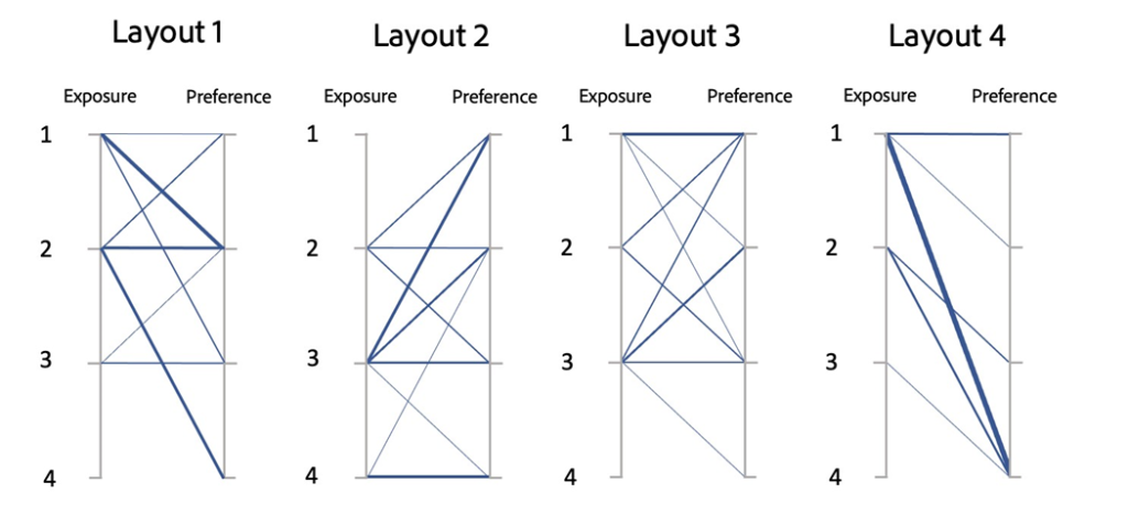
In order to compare report layout consumption to preference, we converted participants’ percentage of exposure to each layout to rankings. For example, if someone reported being exposed 65% of the time to Layout 1, 20% to Layout 2, 10% to Layout 3 and 5% to Layout 4, the most to least consumed formats are Layout 1, Layout 2, Layout 3 and Layout 4 in that order. If someone reported being exposed equally to more than one layout, we placed the layouts in the same ranked position. Figure 3 shows how exposure rankings compare to preference rankings for each layout. Overall, the most prevalent layouts are also the most preferred layouts for about 42% of the analysts (n=8). On the other hand, 8 analysts ranked their most prevalent layout as least preferred. We can see that most participants who tend to be mostly exposed to Layout 4 ranked it as least preferred.
Report Formats and Decision Strategies
Decisions often differ in nature and require different decision-making processes and decision aids. While there are a number of ways to classify decision strategies, we adopted the classes of decisions from the business intelligence literature, which define three main types of decisions, namely strategic, tactical, and operational. A strategic decision can be defined as a long term, complex decision that often has a high impact. They are non-repetitive in nature and involve careful evaluation of several alternatives. Tactical decisions occur with greater frequency as often relate to the implementation of strategic decisions. Finally, operational decisions relate to daily operations and are often low impact.
From Report to Decision
We asked analysts to describe the steps they take from reading a report to making a decision. We annotated common themes across responses and found that 7 responses included the process of correlating the report with the current effort and identifying operational actions in the report.
“I must recognize something in the text that can be operationalized or that relates to a specific customer’s needs.”
Another common process mentioned by 6 analysts is cross-referencing with other reports and sources. One analyst mentioned that they verify questionable information and another makes sure to verify who the author of the report is.
“Reading the report, source descriptor, and source confidence as well and other reports relevant to a topic all play a role in making a decision. Typically understanding the information then making sure to put it in its context and reliability and corroborating information from other sources of intel.”
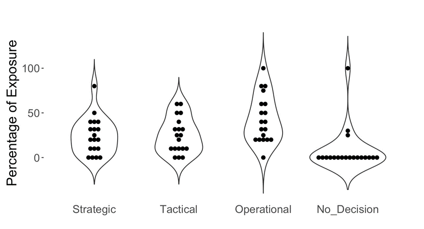
Prevalence of Decision Strategies
Figure 4 shows the prevalence of decision strategies among our pool of analysts. Three analysts reported that their job also constitutes of tasks that do not involve making a decision. We can observe that the distribution of strategic, tactical and operational decisions is somewhat even. On average, operational decisions were more frequent, with a mean prevalence of 43.33%, compared to 24.91 for tactical decisions, 24.12% for strategic decisions and 8.16 for tasks not involving decisions.
Preferred Layout For Each Decision Strategy
We asked analysts to rank which layout they would prefer for each type of decision. For strategic decisions, layout 3 was preferred (n=7), followed closely by Layout 1 (n=6) and Layout 2 (n=6). The preferred layout for operational decision was Layout 3 (n=12). The preferred Layout for Tactical decisions were Layout 1 (n=7) and Layout 3 (n=7).
Discussion & Future Work
Our user study provided valuable insights on how intelligence analysts consume, interact with and make decisions from reports. The majority of responses had high variance due to the diverse nature of roles and functions in our pool of analysts. However, we were able to extract some converging themes and patterns in the data.
First, we found that most analysts value clarity, accuracy, conciseness and relevance the most in reports. Despite this convergence towards these features, analysts reading pattern vary greatly, ranging anywhere between a quick scan and a thorough read. This finding is not surprising as it is likely heavily dependent on the nature of the task. When asking analysts about the steps they take from reading a report to making a decision, several of them highlighted the important of linking the information in the report to the situation at hand. Another common procedure mentioned by several analysts is to cross-reference the report with other sources. This points to the importance of trust in the report, which includes trust in the accuracy of the information or in the author of the report. Analysts have to ensure that the information is valid before proceeding.
We found that on average, most analysts encounter reports with no charts more frequently than reports with charts. The majority of those who are the most exposed to text formats reported to prefer their reports to contain charts where applicable. Preference for the juxtaposition of charts and text vary across analysts. Some prefer to have charts within the text for cohesion, some prefer to read the charts first to get an overview, and others prefer to read the text first to provide context to the charts. Analysts also voted for the best layout for each type of decision. We found that for operational decisions, having the charts within the text received more votes. This is likely due to the sequential and straightforward nature of operational decisions.
Based on our findings, we believe that a personalized interface that accounts for users’ reading patterns and preferences, as well as report type and decision type would be beneficial to intelligence analysts. Further research needs to be conducted to define the interface’s compatibility with the existing workflow. Other more straightforward solutions to improve productivity would be to improve cross-referencing by linking similar reports in a seamless way. Moreover, further investigations into the factors that impact report credibility and trust would be beneficial to support the implementation of systems that detect untrustworthy signals with the goal of improving decision quality.
Acknowledgement
The authors wish to thank our NCSU collaborators for their expertise and guidance, and the 22 decision makers who participated in this study for their time. This material is based upon work supported in whole or in part with funding from the Laboratory for Analytic Sciences (LAS). Any opinions, findings, conclusions, or recommendations expressed in this material are those of the author(s) and do not necessarily reflect the views of the LAS and/or any agency or entity of the United States Government.
References
[Borkin et al.(2015)] Michelle A Borkin, Zoya Bylinskii, Nam Wook Kim, Constance May Bainbridge, Chelsea S Yeh, Daniel Borkin, Hanspeter Pfister, and Aude Oliva. 2015. Beyond memorability: Visualization recognition and recall. IEEE transactions on visualization and computer graphics 22, 1 (2015), 519–528.
[Bransford and Johnson(1972)] John D Bransford and Marcia K Johnson. 1972. Contextual prerequisites for understanding: Some investigations of comprehension and recall. Journal of verbal learning and verbal behavior 11, 6 (1972), 717–726.
[Brunyé et al.(2006)] Tad T Brunyé, Holly A Taylor, David N Rapp, and Alexander B Spiro. 2006. Learning procedures: The role of working memory in multimedia learning experiences. Applied Cognitive Psychology 20, 7 (2006), 917–940.
[Hullman and Diakopoulos(2011)] Jessica Hullman and Nick Diakopoulos. 2011. Visualization rhetoric: Framing effects in narrative visualization. IEEE transactions on visualization and computer graphics 17, 12 (2011), 2231–2240.
[Hullman et al.(2013)] Jessica Hullman, Steven Drucker, Nathalie Henry Riche, Bongshin Lee, Danyel Fisher, and Eytan Adar. 2013. A deeper understanding of sequence in narrative visualization. IEEE Transactions on visualization and computer graphics 19, 12 (2013), 2406–2415.
[Kosara and Mackinlay(2013)] Robert Kosara and Jock Mackinlay. 2013. Storytelling: The next step for visualization. Computer 46, 5 (2013), 44–50.
[Levie and Lentz(1982)] W Howard Levie and Richard Lentz. 1982. Effects of text illustrations: A review of research. Ectj 30, 4 (1982), 195–232.
[Segel and Heer(2010)] Edward Segel and Jeffrey Heer. 2010. Narrative visualization: Telling stories with data. IEEE transactions on visualization and computer graphics 16, 6 (2010), 1139– 1148.
[Stokes et al.(2022)] Chase Stokes, Vidya Setlur, Bridget Cogley, Arvind Satyanarayan, and Marti A Hearst. 2022. Striking a Balance: Reader Takeaways and Preferences when Integrating Text and Charts. IEEE Transactions on Visualization and Computer Graphics (2022).
[Zhi et al.(2019)] Qiyu Zhi, Alvitta Ottley, and Ronald Metoyer. 2019. Linking and layout: Exploring the integration of text and visualization in storytelling. In Computer Graphics Forum, Vol. 38. Wiley Online Library, 675–685.
- Categories: